
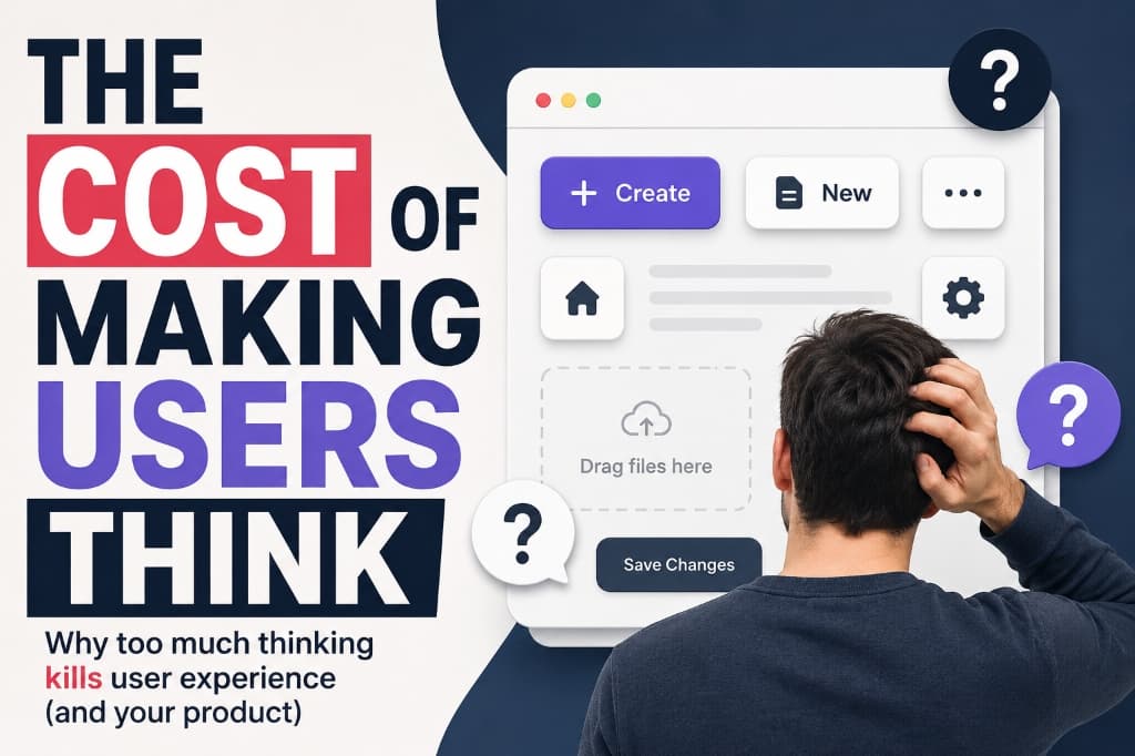
The Cost of Making Users Think
Your product can work perfectly without bugs or crashes, and users can still leave. Learn why cognitive friction is a UX problem and how good products save the user's thinking for what actually matters.
Your product can work perfectly. No bugs. No crashes. No broken buttons. And users can still leave.
Your product can work perfectly.
No bugs.
No crashes.
No broken buttons.
Everything does exactly what it's supposed to do.
And users can still leave.
Why?
Because sometimes the problem isn't that your product doesn't work.
It's that using it feels like work.
"Where should I click?"
"What does this button do?"
"Did that actually save?"
"Am I supposed to drag this?"
"What happens if I click this?"
The product isn't broken.
But the user is thinking too much.
And that's a UX problem.
Every Question Creates Friction
Imagine opening an app for the first time.
You see five buttons.
Three icons.
A three-dot menu.
A settings icon.
And a big button that says "Create."
You pause.
"Which one am I supposed to use?"
That tiny pause might not seem important.
But that's friction.
Friction isn't always a loading screen or an error message.
Sometimes, it's just a few seconds of uncertainty.
"What am I supposed to do here?"
And if users keep asking that question throughout the product, the experience starts feeling exhausting.
You Know Your Product Too Well
This is one of the easiest mistakes for product teams to make.
You build something.
You use it every day.
You know where everything is.
You know what every icon means.
You know which button to click first.
So eventually, the interface feels obvious.
But it isn't obvious to someone seeing it for the first time.
That's why something that feels completely clear to the team can leave a new user confused.
You don't see the learning curve anymore because you've already climbed it.
Clever Isn't Always Better
There's a temptation to make interfaces clever.
Remove the label.
Use an unusual icon.
Hide an option inside a menu.
Replace a familiar action with something more "minimal."
It might make the interface look cleaner.
But cleaner doesn't always mean easier.
A user shouldn't have to figure out your interface before they can use your product.
Clarity beats cleverness.
If a simple label can remove a question, use the label.
If an obvious button can remove hesitation, make it obvious.
Every Extra Choice Has a Cost
More options sound good.
More templates.
More settings.
More formats.
More customization.
More control.
But every additional option also asks the user to make another decision.
Think about ordering food.
Choosing between five dishes is easy.
Choosing between 150 dishes?
Now you're doing research just to decide what to eat.
Software can work the same way.
Sometimes users don't need more choices.
They need help choosing the right one.
That's why good products don't just give users options.
They reduce unnecessary decisions.
Good UX Almost Disappears
Think about the products you love using.
You probably don't spend much time thinking about their interface.
You just use them.
You know where to click.
You understand what happens next.
You know when something is finished.
Nothing gets in the way.
And that's the interesting thing about good UX.
When it works, you barely notice it.
You just think:
"That was easy."
That's the goal.
Not to impress users with the interface.
To make the interface disappear.
Defaults Can Do the Thinking
One of the simplest ways to reduce friction is to make sensible decisions for users.
Don't ask them to configure twelve settings before they can try the product.
Give them a sensible default.
Don't make them choose a format if 90% of users will use the same one.
Start with the common option.
Don't remove control.
Just don't make users exercise that control when they don't need to.
Good defaults save decisions.
Empty States Shouldn't Be Dead Ends
Here's another common problem.
A user opens a dashboard for the first time.
There's nothing there.
And the screen says:
Okay...
Now what?
Compare that with:
And there's one clear button.
Same empty screen.
Completely different experience.
The first one reports a situation.
The second one tells the user what to do.
An empty state shouldn't just explain what's missing. It should show what's next.
Errors Should Help, Not Confuse
Errors are another moment where products make users do unnecessary detective work.
Okay.
What does that mean?
What am I supposed to do?
Compare it with:
Now the user knows:
- What happened
- Why it happened
- What to do next
That's what a good error message does.
It doesn't just say something went wrong.
It helps the user recover.
Don't Make Users Remember What Your Interface Can Show
Imagine creating a password.
You enter one.
Click submit.
Then the product tells you:
"Password must contain 8 characters, one uppercase letter, one number, and one special character."
So you try again.
And maybe again.
Why make the user remember the requirements after failing?
Show them while they're creating the password.
The same principle applies everywhere.
If information is useful at a particular moment, show it at that moment.
Don't force users to remember something your interface could simply tell them.
Good interfaces support memory instead of demanding it.
The Cost Is Bigger Than It Looks
Making users think too much doesn't always cause an obvious failure.
Nobody sees an error message saying:
"User experienced too much cognitive friction."
Instead, they just leave.
Or abandon onboarding.
Or skip a feature.
Or submit a support request.
Or never discover something you spent weeks building.
One confusing button probably won't kill your product.
But dozens of tiny moments of uncertainty can make the entire experience feel difficult.
And that's the dangerous part.
Users don't always complain about friction. They just stop moving forward.
Watch Someone Use Your Product
There's a simple way to find these problems.
Give your product to someone who hasn't used it before.
Don't explain it.
Don't point at the buttons.
Don't say:
"Click here."
Just watch.
- Where do they hesitate?
- What do they click first?
- What do they misunderstand?
- What do they ask?
- Where do they stop?
Those moments are valuable.
Because every time you have to explain something that the interface should have communicated, you've found a UX problem.
Make the Right Thing Obvious
Good UX doesn't mean removing every button.
It doesn't mean making everything minimal.
It doesn't mean turning your interface into a blank screen.
It means making the right action obvious.
Users should be able to understand:
- Where they are
- What they can do
- What they should do next
- What just happened
- What to do when something goes wrong
The less effort required to answer those questions, the easier the product feels.
Design store-ready screenshots in minutes — free, no export watermarks.
Launch Shots is free forever. Every template(110+), 220+ device frames plus 3D mockups, AI localization to 84 store languages, and direct upload to App Store Connect and Google Play Console. No credit card needed.
Start creating free →Final Thoughts
Every product makes users think.
That's unavoidable.
Users need to make decisions.
They need to provide information.
They need to learn some things.
But not every decision needs to be theirs.
Not every action needs an explanation.
Not every feature needs another option.
The best products don't eliminate thinking.
They save the user's thinking for what actually matters.
Because when users spend less time figuring out how your product works, they have more time to actually use it.
And sometimes, the best UX improvement isn't adding another feature.
It's removing one more thing the user has to think about.