
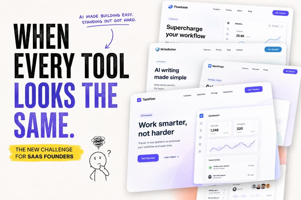
When Every Tool Looks the Same
When AI tools make building software easier, standing out gets harder. Discover why modern SaaS products end up looking identical and how to build a recognizable visual identity.
Open ten SaaS websites today. You might notice something strange.
Clean white backgrounds.
Rounded cards.
Soft gradients.
Huge headlines.
A few product screenshots.
An AI feature somewhere.
And a button that says Get Started.
Everything looks polished.
Everything looks modern.
And somehow...
Everything starts to look the same.
The AI Era Made Building Easier
Building software has never been this accessible.
You can describe an idea to an AI tool and get a working prototype.
You can generate a UI in minutes.
You can create logos, illustrations, copy, and marketing assets without a huge team.
That's incredible.
But there's a side effect we're starting to notice.
When everyone has access to similar tools, it's easier for everyone to end up with similar results.
The cost of creating software has gone down.
But standing out has become harder.
The New Problem Isn't Building
A few years ago, simply building a decent product was difficult.
You needed developers.
Designers.
Time.
Money.
A lot of it.
Today, a small team can build something that looks surprisingly polished.
A solo founder can launch a product that might previously have required an entire team.
That's great.
But it also changes the competition.
Looking professional is no longer enough.
Because everyone can look professional now.
The Same Design Patterns Keep Appearing
There's nothing wrong with design systems.
They're useful.
They're efficient.
They make products easier to build and easier to use.
The problem starts when everyone uses the same patterns without asking why.
- Same rounded buttons.
- Same card layouts.
- Same gradients.
- Same dashboard structures.
- Same illustrations.
- Same little AI sparkle.
And then there are the headlines.
"Work smarter."
"Save time."
"Supercharge your workflow."
"Powered by AI."
"Built for modern teams."
After seeing enough of these, something weird happens.
You remember the website.
But you don't remember which product it was.
Everything starts blending together.
Familiar Isn't Always Memorable
Familiar design has an obvious advantage.
People understand it quickly.
They know where things are.
They recognize the patterns.
That's important.
But there's a difference between being familiar and being forgettable.
If your product looks exactly like five competitors, users might understand it immediately.
But they might not remember it five minutes later.
And in a crowded market, being understood is only half the job.
You also need to be remembered.
AI Can Amplify the Problem
AI isn't trying to make every product look the same.
It's simply learning from what already exists.
And what's already popular tends to influence what gets generated next.
Ask an AI to create a modern SaaS landing page.
You'll probably get something familiar.
Ask it to create a productivity dashboard.
Again, something familiar.
Ask it for a startup hero section.
You might get the same gradients, cards, typography, and floating UI elements you've already seen a hundred times.
That doesn't mean AI is bad at design.
It means something else is still required.
Judgment.
AI can generate possibilities.
It doesn't automatically know which possibility makes your product recognizable.
Your Product Needs a Point of View
Standing out doesn't mean making your interface weird.
You don't need neon colors everywhere.
You don't need crazy animations.
You don't need to break every design convention.
A point of view can be much simpler.
Maybe your product is extremely minimal.
Maybe it's playful.
Maybe it's bold.
Maybe typography is a huge part of its identity.
Maybe its visual language comes from the industry it serves.
Maybe the way it explains complicated things is completely different.
The important part is intentionality.
Don't be different just to be different.
Be recognizable because you know what you want your product to feel like.
Functionality Can Look the Same Too
This isn't only a visual problem.
AI is also making it easier to build similar functionality.
- Chatbots
- AI writing
- Image generation
- Summarization
- Transcription
- Search
- Automation
Everyone can add an AI feature now.
So saying:
"We use AI."
isn't much of a differentiator anymore.
The interesting question is:
What do you do with it that others don't?
That's where things get harder.
Because copying a feature is easy.
Copying an entire experience is much harder.
Features Aren't Always Differentiators
Imagine two products.
Both have:
- AI
- Analytics
- Integrations
- Templates
- Collaboration
- Automation
Their feature pages look impressive.
But if both products solve the same problem in almost the same way, the feature count doesn't tell you much.
The difference might be in the experience.
How quickly can someone get started?
How well does the product fit into their workflow?
How clearly does it explain what it's doing?
How easily can users get the result they actually want?
How well does it work with the tools they already use?
Sometimes the most important differentiator isn't another feature.
It's how everything comes together.
Your Brand Is More Than a Logo
When people hear "branding," they often think about logos, colors, and fonts.
But your brand is much bigger than that.
It's how you write.
How you explain things.
How your product behaves.
How your website feels.
How your screenshots look.
How you talk to customers.
What you choose to focus on.
What you choose to ignore.
Two products can have almost identical functionality and still feel completely different.
Because they have different personalities.
And personality comes from decisions.
The Screenshot Problem
There's an interesting consequence of all this when it comes to product visuals.
If every product uses the same generic mockups, the same device frames, and the same presentation style, even good products can start to blend together.
Your screenshots aren't just there to prove that your product exists.
They're one of the first opportunities to create recognition.
Show the interface clearly.
But also think about:
- Composition
- Context
- Story
- Consistency
- Visual identity
A screenshot should help someone understand your product.
But ideally, it should also help them remember it.
Don't Optimize Everything for "Modern"
Modern design is useful.
But modern isn't a personality.
If your only design goal is:
"Make it look modern."
you'll probably end up looking like everyone else who had the same goal.
Instead, ask a different question:
What should people feel when they see this?
- Confident?
- Creative?
- Technical?
- Friendly?
- Premium?
- Playful?
- Focused?
That question leads to much more interesting design decisions.
The Human Advantage
As AI gets better at generating software, design, and content, human judgment becomes more important.
Not less.
AI can create ten variations.
Someone still needs to choose the one that actually represents the product.
AI can generate a landing page.
Someone needs to decide what the company should stand for.
AI can write a headline.
Someone needs to understand what customers actually care about.
The advantage isn't refusing to use AI.
It's using AI without letting it decide your identity.
You Don't Need to Be Completely Unique
There's another important point.
You don't need to reinvent software design.
Successful products borrow ideas from each other all the time.
That's normal.
Users actually benefit from familiar patterns.
If every app worked completely differently, using software would be exhausting.
So the goal isn't to create something nobody has ever seen before.
It's to create something that feels distinct within a familiar world.
Use conventions where they help.
Break them when breaking them creates value.
That's where good product design lives.
Design store-ready screenshots in minutes — free, no export watermarks.
Launch Shots is free forever. Every template(110+), 220+ device frames plus 3D mockups, AI localization to 84 store languages, and direct upload to App Store Connect and Google Play Console. No credit card needed.
Start creating free →Final Thoughts
The internet is entering an interesting phase.
Building software is becoming easier.
Designing interfaces is becoming faster.
Creating content is becoming cheaper.
Launching products is becoming more accessible.
That's exciting.
But when everyone gets better tools for creating, the things that make a product recognizable become even more important.
Your product doesn't need to scream for attention.
It needs to have a reason to be remembered.
Because in a world where everyone can build...
the hardest thing might not be creating something new.
It might be making sure people can tell yours apart.